Q&A: print designer Lisa King
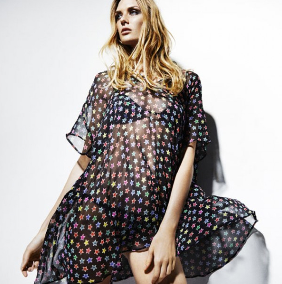
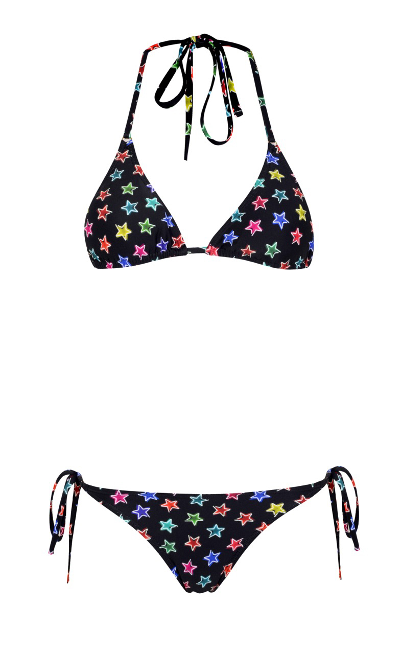
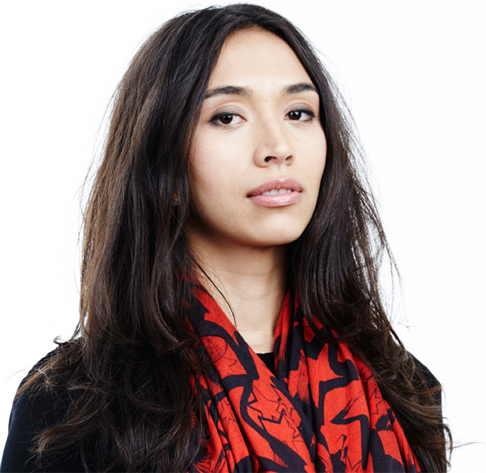 I first met Lisa King in 2013 when she was working with a single graphic, a minimalist image of a screw top. Even then, repeated across uncompromisingly monochrome scarves, the print was compelling, a dynamic representation of a vital but overlooked ingredient in an urban world. One stormingly successful pop up at BoxPark later and it was clear Lisa was going places. A multicultural background - Lisa was born in Thailand - and a prior career as a consultant, developing print and swimwear for luxury brands including Issa, Myo Swimwear and B*Boy by William Baker stood her in good stead. The colour and richness of subsequent designs have won her ardent fans. Diverse ideas are prevalent; deconstructed feminine florals began as travels through her mother’s native Indonesia; the opulent Seraphim and Soho Star prints juxtapose ideas of religion and sex. The fusion of illustration and photography and the complex journeys each print takes from conception to production create wearable art. Demand led to the introduction of swimwear and silk beach cover ups. I speak to Lisa about scarves, swimwear, icebergs and frozen flowers.
Bel: How would you describe the last two years? Lisa: A roller coaster. In 2013, it was very much about how one print, the screwprint, can work across different products and materials but after the pop up, I suddenly had to think about selling commercially. My agency at the time helped me get everything out creatively getting out in terms of prints, illustration, photography. I became more colourful, more concept-driven. Now, I’ve become more concise, again.
Bel: How do you develop your ideas through into prints? Lisa: Each print is an exploration, something representative of things going on in my life at the time. For the ice collection, for example, I saw the documentary Chasing Ice about the National Geographic photographer James Balong. It showed time-lapse photographs of melting ice-caps and I was interested in how you could look at something beautiful, enormous and seemingly permanent, but that’s changing constantly before your eyes. And I was interested in changing perceptions of what is beautiful. With the jewel print, I was interested in how rock in its natural state is arguably at its most beautiful, because that is the purest form, and then we take it and carve it into our own version of perfection.
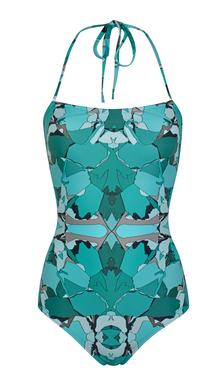
Bel: The imagery you use in the jewel print are your own photographs? Lisa: Yes. My mum has these rough-cut tourmalines and amethysts, and I shot them on a light box. And she has cross-section of crystals so I photographed those, because they’re the sort of refractions in light through stone that you would get in an ice. And the florals … I made my own liquid nitrogen and then we froze some roses and fragmented them. The idea was that, when you freeze something, it becomes permanent but also quite fragile. And when it thaws, it expands and then breaks. The print is like a modern floral. You look at it and you’re think, 'ah, it’s a floral print', but actually all the petals are broken. I like to keep things low-fi. I very rarely, for example, start a print on the computer. It’s more likely to be a drawing I’ve done or a deconstruction of a photograph I’ve taken. It was important for me to shoot those jewels on my own. I don’t like working from second-hand material.
Bel: This isn’t the usual run-of-the-mill scarf creation … Lisa: A while back, I realised there were people that would buy my scarves almost as art pieces and I like that. I always have a deeper meaning to everything that I do. At the same time, the print need to work on a simple, visual level so that people don’t have to know what the print is about to appreciate it.
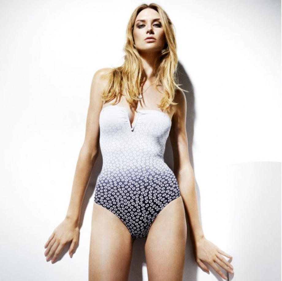
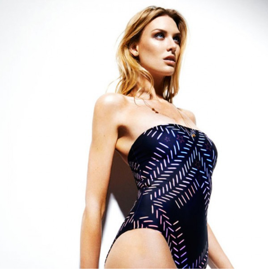
Bel: How did swimwear come about? Lisa: I was a luxury swimwear production consultant for 6 years with William Baker so it’s a form I’m familiar with. I grew up in Thailand, and spent a lot of time on the beach. The swimwear is a natural progression for people who want to wear my prints in a different way. The shapes we’ve made are really simple and clean because, essentially, I wanted very simple canvases for the prints. And because it's only a small bit of fabric, you can afford to be bright and expressive within that.
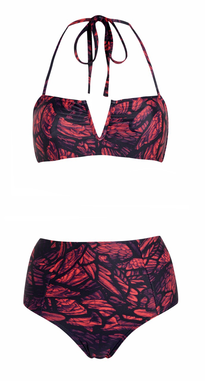
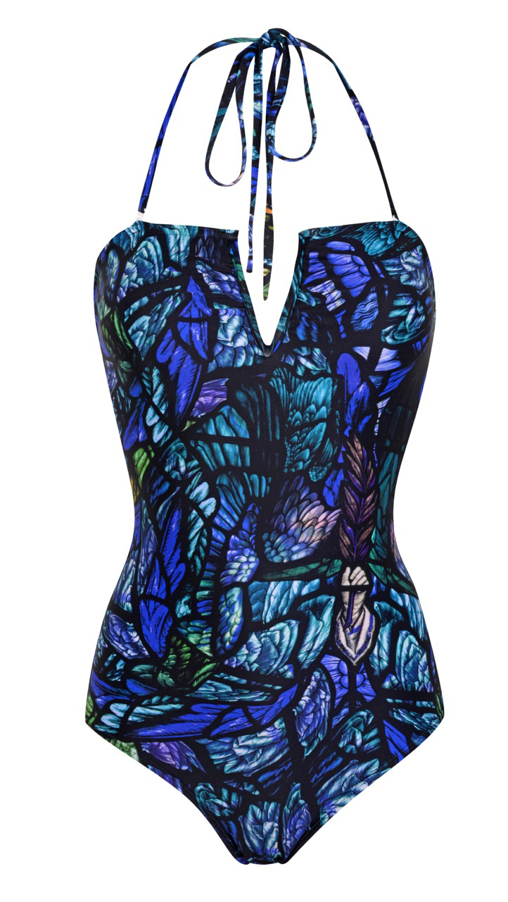
Bel: How did you adapt the prints? Lisa: I knew it was going to take a couple of collections to sell the swimwear into stores so, for the first collection, I put four of my signature prints including the screw print and the florals onto suits, just to test it out. Then I used the print with all the angels’ wings from Exeter Cathedral, the Seraphim print. I can’t produce too many different prints because essentially you need to offer them across a number of shapes that are going to suit different body shapes. That’s been a challenge. You want someone to look great in a print, but it has to be supportive.
Bel: You now sell overseas: how do you create for different markets? Lisa: It’s been a massive learning curve. The Siam collection, for SS15, for example, was a modern interpretation of my version of Bangkok. Instead of the obvious things, like temples and tropical flowers, I wanted to pull out things I think of when I think of Thailand - like rattan balls, fighting fish, the tablecloths from the noodle stalls I used to eat at. Interestingly, my buyers in Japan thought they weren’t really suited to a Japanese customer - that some of the imagery was a bit strong and aggressive - whereas the European buyers loved it.
Bel: What’s the best advice you’ve received as a young label? Lisa: Anna Orsini from the British Fashion Council was talking to us before I showed at London Fashion Week. She said: ‘The problem with designers is that you always do all your ideas in one collection. You have your whole lives to get your message out. Be concise, tell one story at a time.’ And she was right. So I massively edited this collection. There are prints that never even saw the light of day …
